Sourcing Partners
brand identity - logotype & brand stamp - print collateral
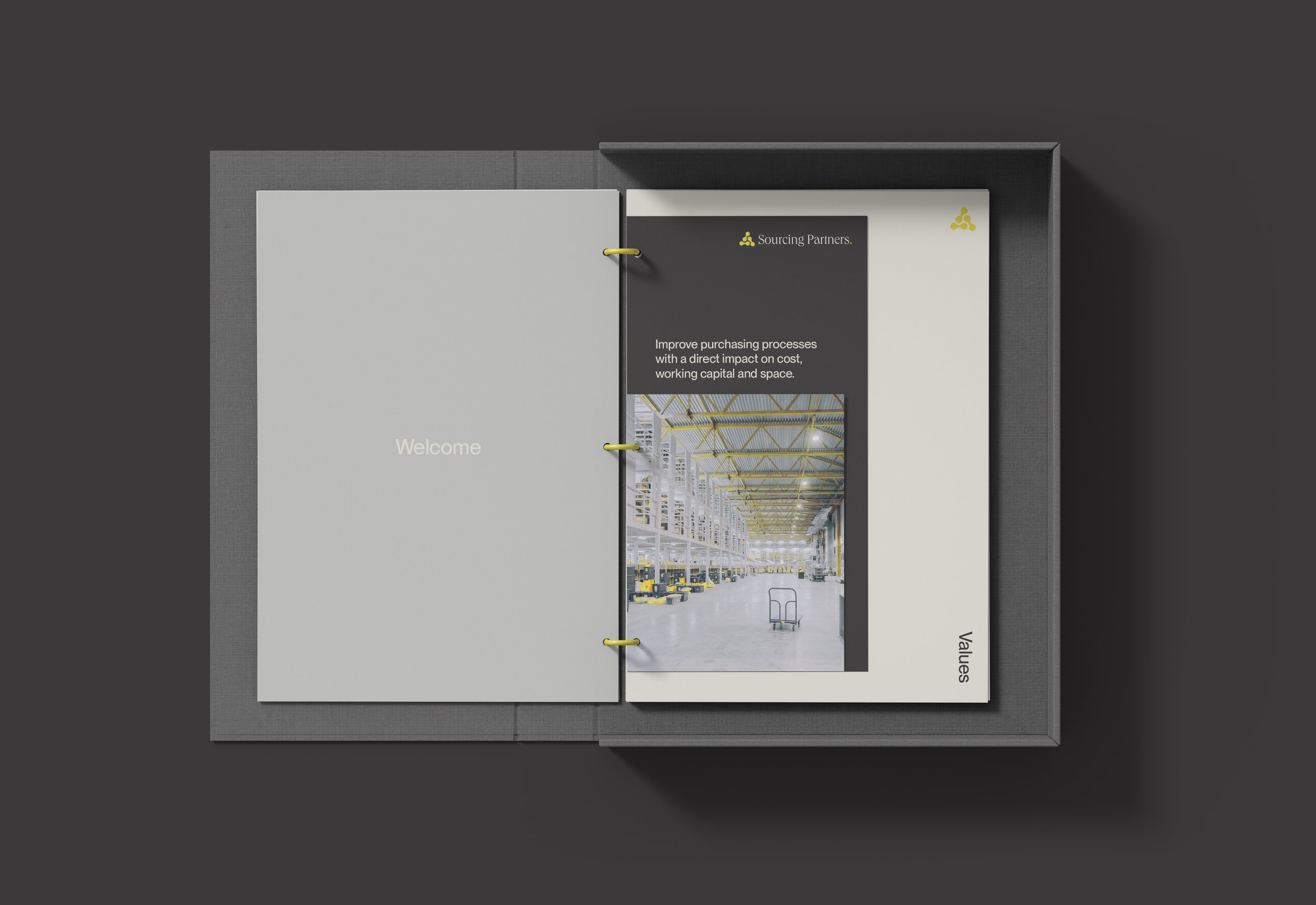
Sourcing Partners offers solutions for small and medium-sized enterprises to improve purchasing processes with a direct impact on cost, working capital and space. The fresh start-up was in need of a full brand identity system that feels both fresh and modern yet also trustworthy. The logo mark references the three services Sourcing Partners offers — sourcing, financing and warehousing, and symbolises the connection they build between external suppliers and their clients. The brand mark is balanced by a light-weight serif word mark, that finishes with a distinctive yellow dot. The recurring yellow dot points to the fact that Sourcing Partners acts as an end destination for companies, to optimize purchasing processes from start to finish.